Large Print Math Worksheets
Free printable large print math worksheets. Ten big problems to a page with generous spacing, for low vision and young writers, with an answer key.
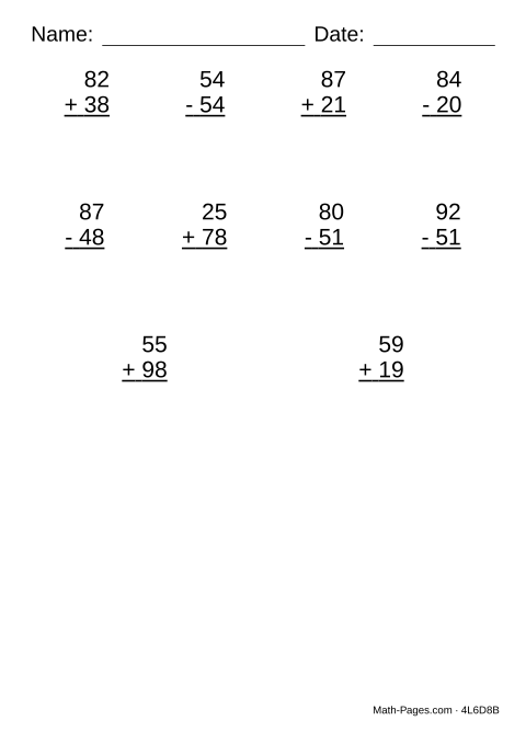
Ten problems to a page, printed large, with plenty of space around each one. This is for a student with low vision, or one whose handwriting is still developing and needs room to form the digits - the same maths as the standard sheet, drawn bigger.
Large print is size and spacing, not a special typeface. A dyslexia-friendly font is a common request, but the evidence that it beats a plain sans-serif at a larger size is thin, and a larger size is exactly what this page gives you. Adjust the number ranges and operations below as usual.
What this worksheet covers
- Add and subtract two-digit numbers with plenty of room to write
- Practice the same math as the standard sheet in larger print
Common Core standards
- 2.NBT.B.5 Fluently add and subtract within 100 using place-value strategies.
Frequently asked questions
Who is large print for?
Students with low vision, and younger students whose fine motor control is not yet up to writing small digits. It is also a common accommodation on an IEP.
Can I put more problems on a page?
You can, but the point is few and large. Ten fills the page at this size; going higher shrinks the digits back down.
Is there a dyslexia font option?
No. The research does not clearly show one helps over an ordinary font at a larger size, and this page already gives you the larger size. If a font is added for another reason it would apply here too.
Does the answer key match?
Yes - the key is printed at the same size and spacing as the worksheet, so it is just as easy to read.